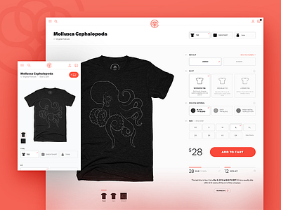
CB Product Page
We shipped a new product page design a few weeks ago at @Cotton Bureau, now allowing for a choice between multiple types of shirts. It was a fundamental shift from the previous structure so most of the UI had to be updated.
We used to rely on product thumbnail images to act as controls when choosing color/fabric type. With this update, we decided to present customers with all available options in one place, while using the product image to reflect selected options. Not a groundbreaking concept, but that's sorta the point. We wanted an experience that was more familiar to new customers and that would be flexible as we add new things in the future.
More by Kyle Ruane View profile
Like
