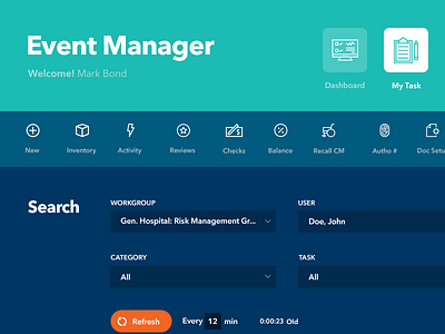
Risk Management App for Hospitals
7 year old interface redesign into modern simple app
App was mostly icons/buttons and forms and lots of tables the objective was to make it sectional and reduce visual noise to make it easy for user to quickly view imp info
Icons decision were crucial it had to be simple enough and descriptive but also do not make the screen overwhelming
More by Rajesh Satyarthi View profile
Like

