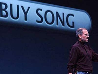
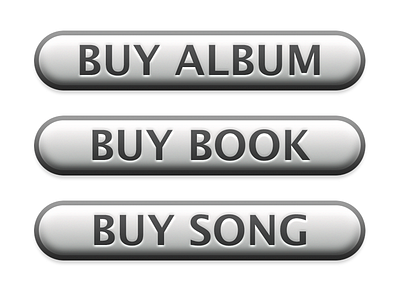
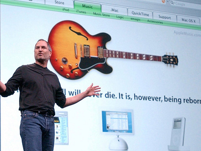
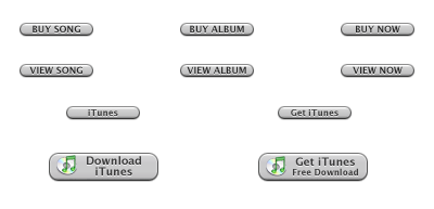
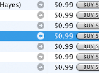
iTunes Buy Song Button / playlist button design (circa 2003)
Design Challenge:
* The main challenge in designing the Buy Song button and the original playlist button was creating a simple and familiar design that would make it easy for people to purchase and listen to music through the store.
* Additionally, I needed to ensure that the buttons were visually appealing and consistent with the overall design aesthetic of the store.
Research:
* In order to design a great experience, I began by researching existing e-commerce and music streaming interfaces.
* They studied the different ways that other companies presented purchase buttons and playlists, and identified the features that made these interfaces successful.
Design:
* I addressed the challenge of creating a simple and familiar design by using a clear and consistent visual design for the Buy Song button and the original playlist button.
* The Buy Song button was designed to be prominently placed next to each song, and used a consistent color scheme (blue) and iconography (shopping cart) to make it immediately recognizable and easy to find.
* The original playlist button was designed to be similarly prominent and easy to use, with a consistent placement and design.
* I also designed a web badging system that allowed people to easily identify music by their favorite artists, and provided them with a direct link to purchase music from that artist through the iTunes store.
* This was later integrated with the Affiliate marketing system and third party website could have their own branded badging which will direct them to the iTunes store.
Evaluation:
* The Buy Song button and original playlist button were key design elements of the iTunes Music Store, and helped to make it easy for people to purchase and listen to music through the store.
* The consistent visual design and placement of the buttons helped to create a sense of familiarity and ease of use. * The web badging system and integration with affiliate marketing helped to further drive sales and promote the store.
Conclusion:
The design of the Buy Song button and original playlist button was critical to the success of the iTunes Music Store. My focus in creating a simple and familiar design, along with a consistent visual aesthetic, helped to make it easy for people to purchase and listen to music through the store. The web badging system and integration with affiliate marketing was an additional step towards making the buying process even simpler and more efficient.
