Geographical Heat Map
Here's a snapshot of Geographical Heat Maps from my recent project "Your guide to Data Visualization". Check out the complete project on Medium and Behance.
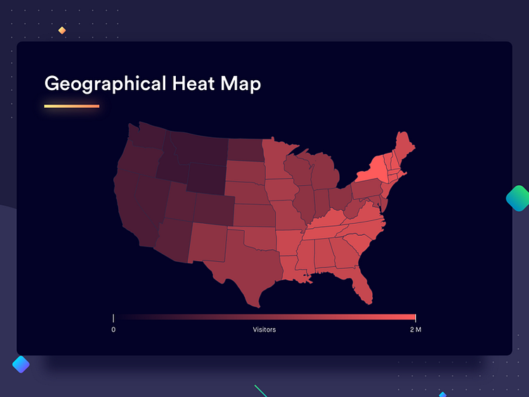
Similar to the rectangular heat map above, in this case also the variables under comparison are represented by heat signatures. In a geographical heat map, the categories under comparison are the geographies (continents, countries, states, etc). You might have seen this in the weather reports on news channels. The geographies under comparison can have a clearly defined boundary, or they might not depending on the data and the use case.
To grasp the concept better, the example here shows the traffic on a website from various states of the United States of America. This would immediately give the user an idea to which states are contributing the most and least towards traffic.
Best Practices for Geographical Heat Maps 1. Just like the rectangular heat map, use contrasting colors to represent extremes of the heat signature (too cold and too hot, or high frequency and low frequency)