Splitting Up Search
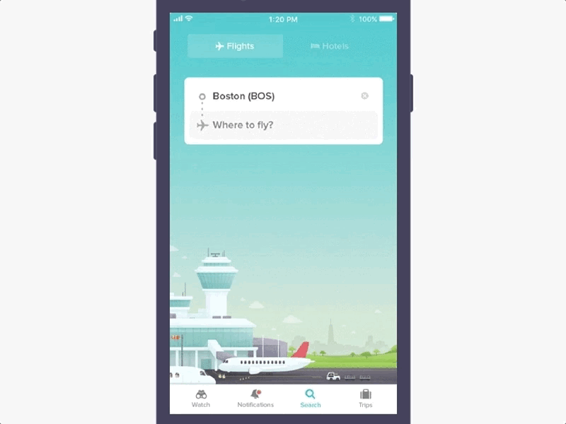
Do you want to fly somewhere or stay somewhere?
With this revamped search screen, we decided to create 2 distinct entry points to give our users a unique environment to search for what they want.
Less confusion and more focused interactions!
We put a lot of effort into making each search box distinct. From the choice of copy to the use of different icons to the displayed background, we made sure to create a minimalist layout that avoids graphical confusion.
We also added a nice little “Hopper” touch with the help of @Thomas Fitzpatrick by introducing an immersive illustration that spans across both search screens to ease the visual transition from Air to Hotels.