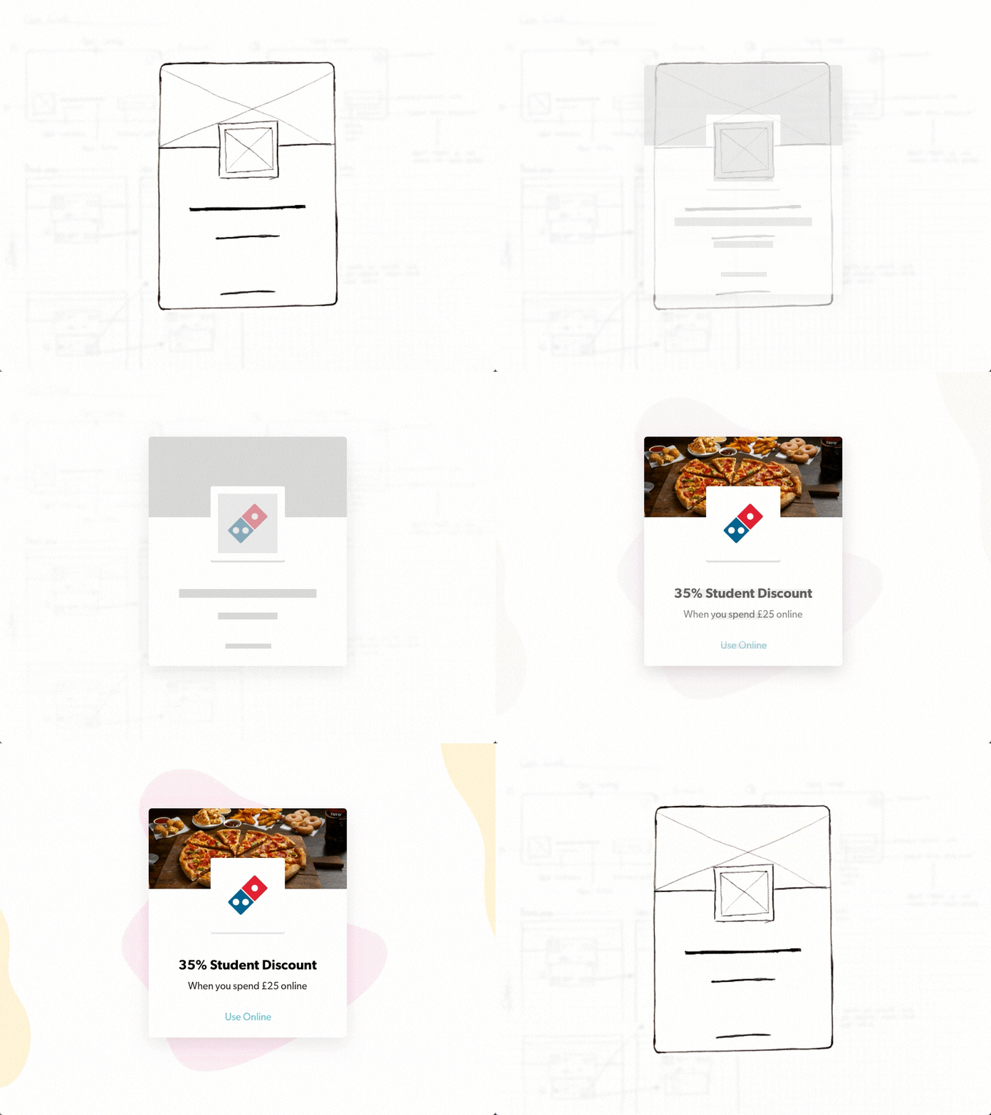
New Discount Tile Design
🎺We have recently given our Discount Tiles a little facelift, not only improving their readability and functionality, but also their overall aesthetic.
Our aim was to improve the clarity of the tiles, making it more obvious to the user what the discount was and where they redeem the discount, online or instore.
Our previous tiles were composed of many different elements; the discount image, logo, title, and discount type, they all individually linked through to the offer page, but this resulted in areas of the tile becoming dead zones. Our new tile is treated as a single entity that in it's entirety links through to the offer page, we did this to improve usability and click through rate. 🎉
More by Student Beans View profile
Like


