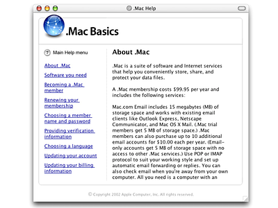
Help System for Apple .Mac (Instructional Design)
Design Challenge:
* The main challenge in designing the help systems for .Mac was creating a familiar interface that would make it easy for people to find the information they needed and understand how to use the various features of the service.
* Additionally, I needed to ensure that the help systems were consistent with the overall design aesthetic of Mac OS X, and that they were easily accessible.
Research:
* In order to design a great experience, I began by researching existing help systems and online documentation for similar services.
* They studied the different ways that other companies presented help information and identified the features that made these interfaces successful.
Design:
* I addressed the challenge of creating a familiar interface by adopting a design language called webAqua, which was specifically designed for Mac OS X.
* This design language was characterized by the use of a clean and simple layout, with a focus on typography and white space.
* To help people easily find the information they needed, I used a hierarchical organization of information, with clear headings and subheadings to indicate the different sections of the documentation.
* These help systems also included an extensive search functionality, which allowed people to quickly find specific information by keywords.
Evaluation:
* The webAqua design language was considered to be a help, and was subsequently adopted as a company-wide model for instructional design, used across a wide range of Apple's products and services.
Conclusion:
The design of the help systems for .Mac was a crucial component in the success of the service. My focus on creating a familiar interface, along with the adoption of the webAqua design language, helped to make it easy for people to find the information they needed and understand how to use the various features of the service. The design system soon became a company-wide model for instructional design, which was used across a wide range of Apple's products and services.


