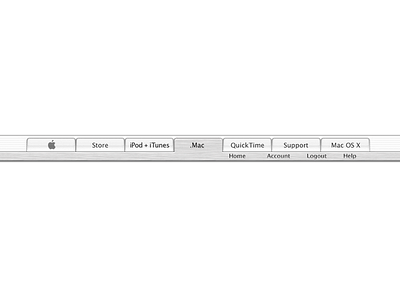
Apple.com main navigation (webmetal treatment)
One of the key challenges in designing the tabbed navigation was differentiating between the webmetal and desktop metal design languages, as well as webAqua and desktop Aqua. Webmetal and webAqua were the design languages used for the website, while desktop metal and desktop Aqua were used for the Macintosh operating system.
We had to find a way to harmoniously blend these two sets of design languages, in order to create a unified experience for users. To do this, they looked at the visual elements, such as typography, color, and iconography, that were commonly used in each design language, and worked to create a high caliber and cohesive look across the different parts of the site.
Webmetal was heavily inspired by the brushed metal treatments you might find in iTunes, for the desktop version of the website, and webAqua. We also paid attention to the subtle visual differences between webmetal and desktop metal, and webAqua and desktop Aqua, such as typography and spacing, to ensure consistency across all platforms.
Another important aspect of the redesign was creating a clear and intuitive navigation system. With a tabbed navigation system, this allowed people to switch between different sections of the website, such as products, support, and shopping, with a single click. This made it easy for people to find the information they were looking for and helped to improve the overall experience.
The tabbed navigation for apple.com was designed by carefully considering the different design languages and business needs. Using combination of webmetal, webAqua, desktop metal, and desktop Aqua to create a cohesive and unified visual identity.

