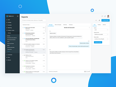
Cutomer support Dashboard (e-Commerce)
Last week, I showed you the products dashboard and, today, I bring you the customer support. I have to say this was a really hard one. The old design was terrible and really hard to understand even working with it for hours or even days. However, I managed to simplify the interface making it easy to understand but keeping all the features we already have in the old version. As you can see, the structure is divided in three columns, where we can manage from the same screen all the messages, the content of the message and all the information of the client and his order.
What do you guys think about it?
Tell me your thoughts in the comments! 😊
Thanks for watching! 😊
More by Jonathan Centeno View profile
Like


