WRD logo exploration
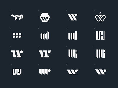


Very early and quick logo exploration for a company that provides B2B digital management and tracking solutions for various industrial-based businesses — like waste management, architecture, building, etc. The dominant letters in the business name are W, R, and D.
The aesthetic objective was to strike a balance between sophisticated and industrial, where white collar meets blue collar. I was given only 5 hours for this exploratory process, and the brief provided scant information. Interestingly, I was able to squeeze in a bit of inspiration gathering, pencil sketching, and digital refinement within that time.
I typically produce my best work when I have lots of information, and have time to research and conduct a thorough investigation of thoughtful and conceptual ideas through multiple iterative brainstorming and sketch phase sessions.
Since this exploration fell outside my preferred process, I feel that many of the concepts explored here lack the depth and thoughtfulness that a truly deep dive can provide, and instead, focus on surface aesthetics. There are a few — like the bee, for example, that are a bit more conceptual.
But mostly, concepts explored here revolve around single W monograms, W-R monograms, and W-D monograms. Many of these were created with a stencil-like aesthetic — something you could imagine seeing on the side of a big piece of industrial equipment.
Check attachments for bigger views and also for sketches.
Which are your favorites, and why?
© The Elixir Haus