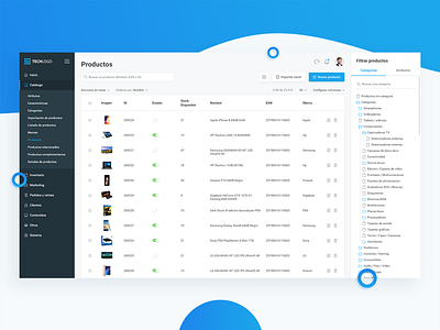
Products Dashboard (e-Commerce)
While I was working on an e-Commerce company, I redesigned a few screens of our dashboard for a better user experience. A few weeks ago, I took a look at them and, even the structure was pretty good, they looked visually horrible 🤣 So, before going on vacation, I decided to redesign them. Now they look cleaner and visually better.
Specifically, this was the products page. From here, the employees managed all the product system of the company with more than 20.000 products.
What do you guys think about it?
Tell me your thoughts in the comments! 😊
Thanks for watching! 😊
More by Jonathan Centeno View profile
Like


