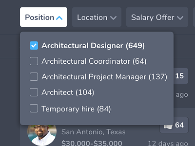
Dark Position Dropdown
Last dropdown menu, I promise. Really proud of the softness and contrast with these dark tones. Rounded off the corners of the checkmark as a final detail to keep it consistent with the rest of the design language.
More by Christopher Denais View profile
Like
