The Grind
The Grind is a small coffee shop chain that prides itself on natural and local ingredients. For their new logo, they did not want to use any browns! So many coffee shops around the local area use browns and they'd like to stand out.
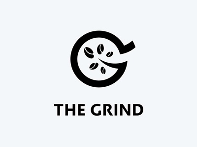
Going in to this challenge, I designed the logo in a way that would show a G and the approach of the business considering the ingredients they use.
Also, you might notice the relationship between the counter of the G and the swash in the upright corner, which is meant to resemble coffee being poured into the cup.
To be honest, I only noticed this aspect of the logo once it was finished, mainly because I was focused on the middle of the letter. It is supposed to represent a tree with coffee beans.
While I was vectorizing using golden ratio circles, I made sure that the beans would look like they could be associated with leaves as well to keep the message and the direction of the business.
