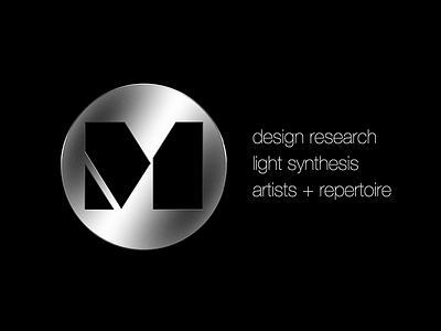
M Concepts visual identity for boutique design firm
Design Research:
Before beginning the design process for the brushed metal "M" logo, it was essential to conduct thorough design research to understand the target audience and the current market trends in the music industry. This included analyzing existing logos used by music labels and artists, as well as gathering feedback from industry professionals and potential customers.
Through this research, we discovered that there was a desire for a logo that was sleek, modern, and visually striking, yet still had a classic, timeless feel. The brushed metal texture was identified as a popular choice for music logos, as it conveyed a sense of sophistication and luxury.
Light Synthesis:
To create the brushed metal "M" logo, we utilized light synthesis techniques to create a realistic metallic finish. This involved layering different shades of gray and silver to create depth and dimension, as well as adding subtle highlights and shadows to mimic the reflections and imperfections of a brushed metal surface.
We also experimented with different font styles and sizes to find the perfect balance between boldness and legibility. Ultimately, we settled on a sleek, sans-serif font that complemented the metallic texture and conveyed a sense of modernity.
Artists & Repertoire:
In addition to the design of the logo itself, we also had to consider how it would be used in various contexts within the music industry. This included creating guidelines for the logo's use on album covers, merchandise, and other marketing materials.
To ensure that the logo could be easily adapted to different styles and genres of music, we worked closely with artists and their teams to understand their specific needs and preferences. This included conducting focus groups and one-on-one interviews to gather feedback and make any necessary adjustments to the design.
Overall, the design process for the brushed metal "M" logo was a collaborative effort that involved extensive research, creative experimentation, and close collaboration with industry professionals and artists. The end result was a sleek, modern logo that conveyed a sense of sophistication and luxury, and was well-received by both industry insiders and fans alike.
