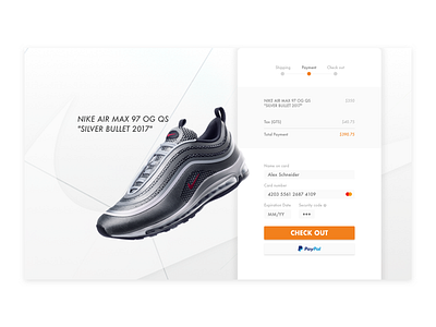
Daily UI Challenge #002_Check out page
Hello everyone!
It is my second day of the Daily UI Challenge. Today I designed a check out page. It took me forever to decide on a page out of twenty pages. I chose this page because it shows the details of the purchase summary. Also, it is white and clean... what kind of designer does not like white or black.
August is almost here and it already feels like summer is ending. I hope everyone enjoys the nice sun outside before it goes away. Cheers!
More by Jina Hwang View profile
Like
