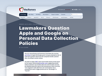
MacRoumors redesign (part II)
Last semester I participated in a digital typography course at my university. The task was to redesign one website with focus on typography. I've chosen MacRumors.
My goal was to bring the look and feel closer to the Apple platform(s) with rounded corners, bold typography and the SF Pro font.
Don't forget to check out the full design in the attachments! (Compared to the current design)
More by Alexander Käßner View profile
Like


