Circledoo | Website
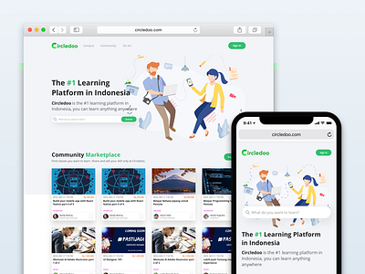
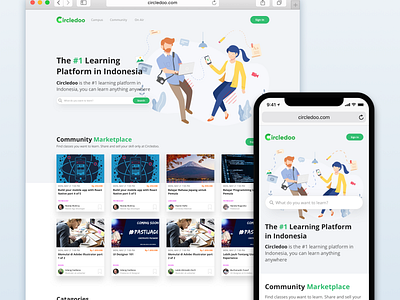
My original direction was to make something much more fun than a formal online course. Through use of vibrant colors, active typography, and a robust grid, my goal was to create a website that people actually had fun using. While the design changed over time, I made sure that the playfulness and energy were not lost. Many of the design elements from the early mockups are seeds of ideas developed more fully in the final prototype.
Don't forget to join or create class there!
More by Burhanudin Yusuf View profile
Like


