🏋️♂️ I discovered visual weight

I'm trying to discover alternative styles and how can I use them to improve designs.
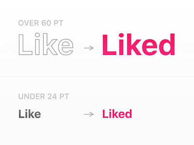
I know there's some ways to decrease weights of big banner-like titles, like make the color much lighter. But it decreases accessibility and delivers unstable results accross difference sizes.
So to make bigger titles outlines surely is big pain in the 🍑, but if you really bothered with Look & Feel you can try to implement them. I bet they will look great on dark UI in cinema industry.