Glorious conference
So Glorious...
It was huge project. I mean, I never spent more than 150 hours on webdesign for presentation website ever before.
There was more than half year of designing and development. Several versions and updates and more than 1Gb data in Sketch.
The task was simple. Make the best website for conference in Czech, that represent this huge event and get new visitors.
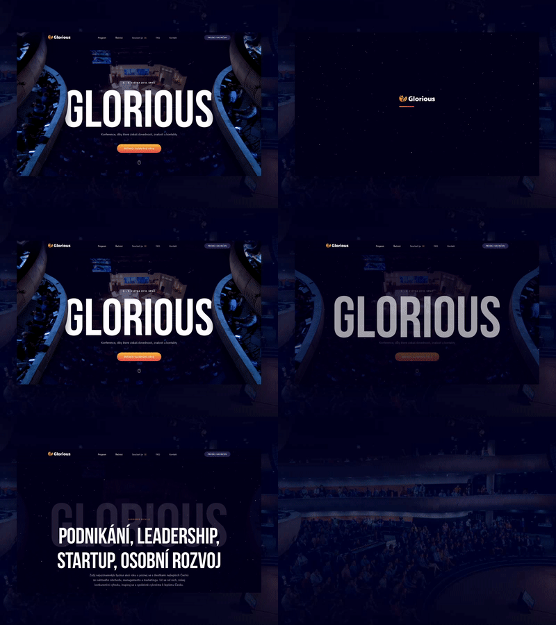
This is small sneak peek of main page. I wanted to make really impressive first moment for visitors. So I took floors of Sono centrum and thanks to parallax I gave them life...
Wanted to see live: https://konferenceglorious.cz/
More by David Dvořáček View profile
Like
