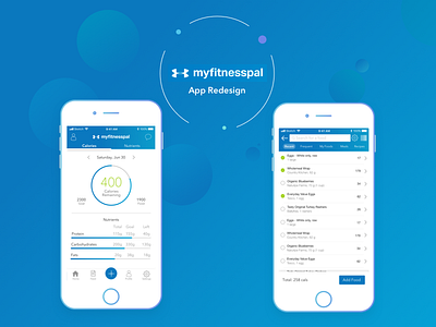
MyFitnessPal Redesign
Hello Dribble! These are two of the main screens from a recent UX Case Study I did based around redesigning and improving some of the screens from MyFitnessPal, with the goal being to improve user flows for some of the app's main functionality
As a daily user of MyFitnessPal, it was important for me to base these redesigns around currently existing designs and components, not totally redesigning the app from the ground up which may put off users, while still making enough tweaks and UI changes to be noticeable. This in itself was as much of a challenge as the logic behind what I redesigned and why.
The branding and colour palette here remain true to MyFitnessPal's existing blue, white, and green tones, with some added gradients to bring a bit more pop to some elements where I could.
The redesigns themselves are based around feedback from usability testing, which found that some of the main issues users were having were around searching for, and adding various food items, as well as the home screen of the app not being focused around its primary functionality. I attempted to change that with tweaks to the UI, Navigation Bar, and overall user flow.
The initial wireframes and some of my more behind-the-scenes thinking can be found on my Instagram
If you're interested in reading the full UX Case Study which documents everything, you can find it on Medium

