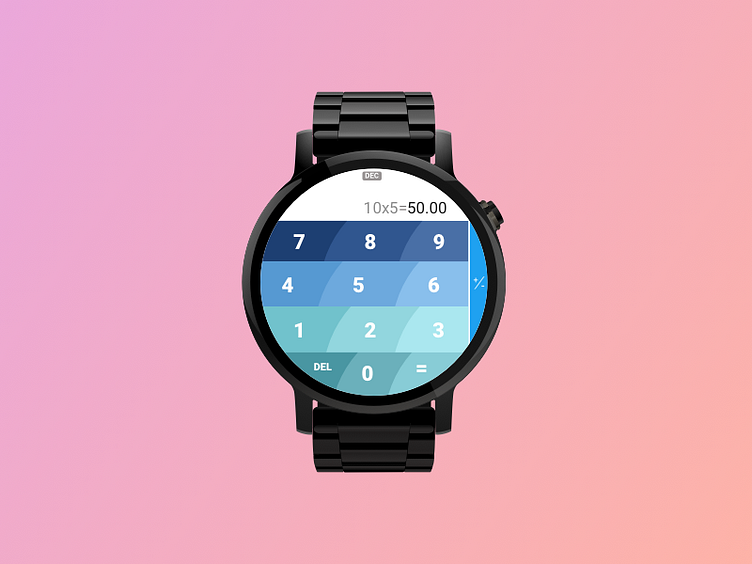
Calculator Button Ergonomics
Problem: Calculator was traditionally a rectangular device, and when applied to a round interface on usual watches drastically reduce the tappable area for some of the buttons. Its very clear that you cant simply use square buttons on a round interface to get the same results.
Solution: 1. Buttons follow the curvature of the screen within which they are placed, dividing the available space equally. 2. The text within the button act as sort of a "target" to aim for, they are placed such a way that they dont necessarily form a grid, but identify the button's center. 3. For a right handed user (watch is worn on the left), this is a more ergonomic button semantic, given that the fingers will be pointing to the left of the screen.
Hope this changes things.
