INNWIT - Agency & Personal Page
I gave a try being more creative today :)
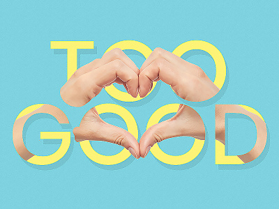
Made a combination between text and images, making the image overlapping like a ¨snake¨ all over the typography.
Do you think it makes the design interesting having combinations similar to this? On a scale from 1 to 10 (10 being the most important step) how important you think is the use of images right next to the typography into a design?
If you have questions, suggestions or any feedback for me, you are always welcome to leave them in the comment section.
And don't forget - If you love my work, I love you :)
Like it by clicking on the "L"
More by Dia Dea View profile
Like

