Lightbulb heart
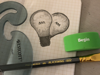
Concepting a logo. It’s deliberately a bit lopsided right now. Not sure if I’m going to keep that but I don’t love the second base popping out below. The absence is less noticeable this way. Anyway this will also have a black and white version with gradient eventually. Thoughts? Suggestions? I’d love a little feedback!
