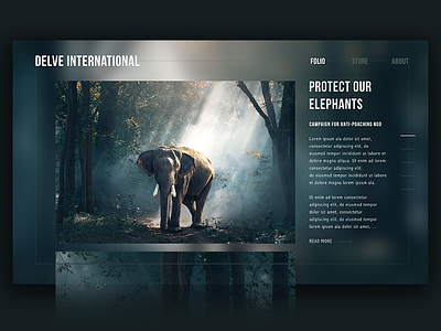
Portfolio Website Study
This is a website study I made one afternoon, as I realised I had never designed a 'dark' theme before.
Exploration of user experience and through-flow. I may animate the transition from one photo to another at some point.
More by Simone Luker View profile
Like
