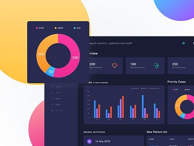
Dashboard for healthcare
One of the screens I designed while working on the dashboard of a medical platform. This was my first attempt at something so complex. The dashboard gives quick bytes of information to its users (admin staff, doctors). The idea behind using a dark background and bright colours was to attract the attention of users so that no information is missed out.
Hope you guys like the design. I would love to hear your feedback on them.
More by Quovantis View profile
Like


