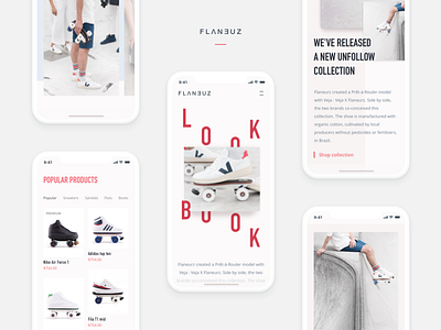
Mobile Version of Roller Skates Project Website
Hey guys!
Remember I shared some designs I created for a roller skates website? I especially liked experimenting on their lookbook page, and that’s what I ended up with. Well, this time I’d like to share the mobile version of the website, namely its lookbook page.
Goals
Adapting the website to all devices to provide a better user experience. Rethinking the way content is displayed on the page to make it more appealing to the target audience to help the guys get more foot traffic and popularize their cool product.
Approach
We were tasked to come up with a trendy and catchy look for the website to appeal to the youth because the product is mainly targeted at this group. To this end, we chose to use pastel color palette and broken grid to add a little twist to the overall style. The only elements we used more intensive colors on are the CTAs for pretty obvious reasons I guess. Big, appealing visuals are an integral part of a look page, so we used quite a lot of them trying to arrange them in the most efficient and nice-looking way.
Results
We ended up with a clean and visually rich website adapted to all devices which makes it easier and more comfortable to use, and therefore, allows attracting more customers and more revenue as a result.
Eager to find out what you think of that!
Press "L" to show some love!
ᗈ Website
ᗈ TheGrid
ᗈ Spotify
ᗈ Twitter
ᗈ Medium
ᗈ Facebook
ᗈ Instagram

