Sign in
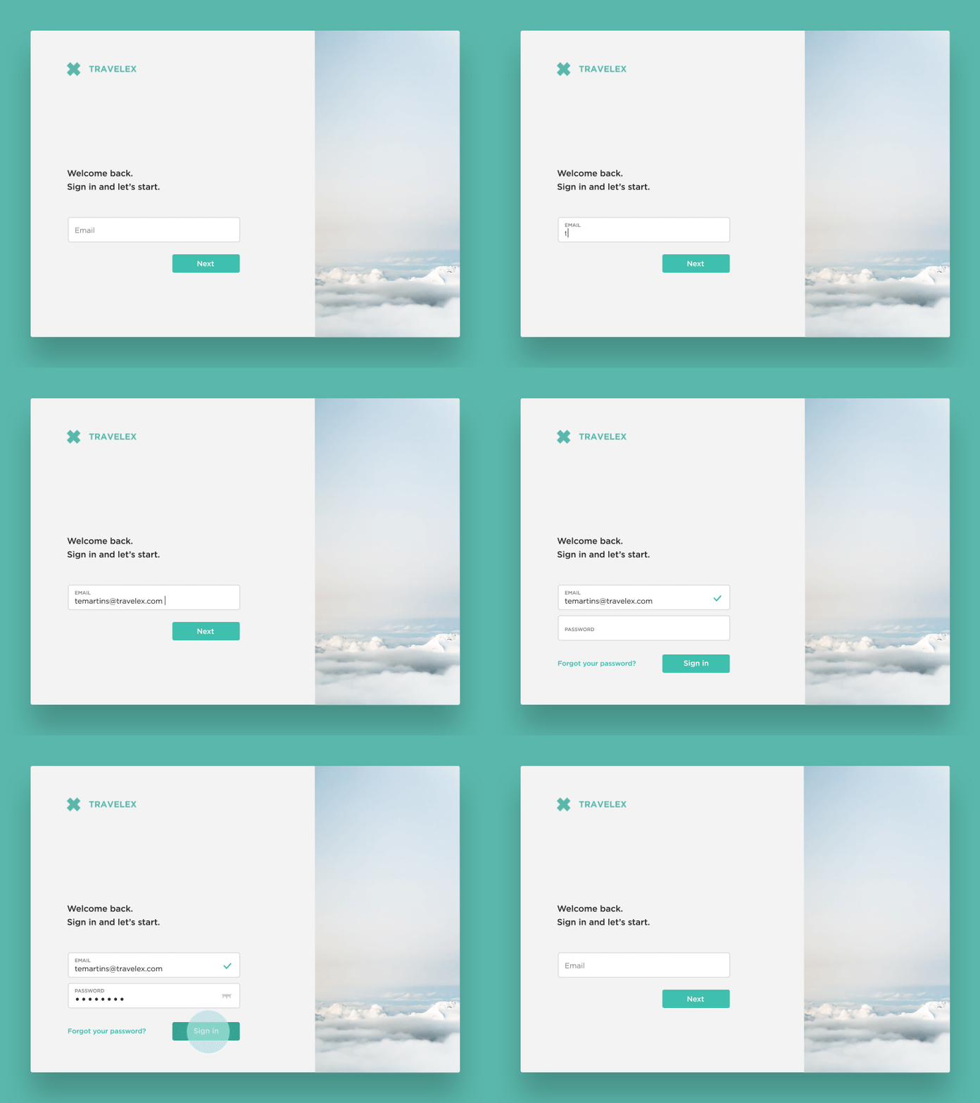
During work on the Sign in page we had a challenge: 15% of users of the website use internal sign-in system, so they are redirecting to another website. Solution with tabs for 2 different types of user brings extra click. So we decided to make 2-step sign in: - part of users will go to another website after completing e-mail field - other users will get 'password' field. But with a help of 'tick' and animation, it won't be confusing.
Also here's auto validation of email, so user doesn't need to press 'next' button.
More by Sergii Filonenko View profile
Like
