Slack Mobile App Redesign | Day 205/365 - Project365
Day 205/365 - Slack Mobile App Redesign Concept
For Redesign Tuesdays, I usually would incline to redesign interfaces that I have been using regularly.
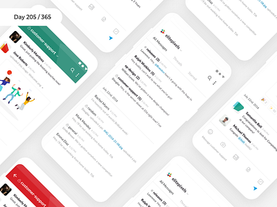
Here's my take on the Slack mobile app.
Currently, there's no home screen for slack. It directly jumps into a conversation which isn't a smooth user experience.
Knowing the channel or the person who sent me a DM would be critical information that I'd like to see before-hand!
This is the approach that I've taken to solve this particular problem.
Rest of the design language remains the same as Slack, because that works pretty well IMO.
What do you think?
What is Project365?
Visit Project365.design
More by Kishore View profile
Like

