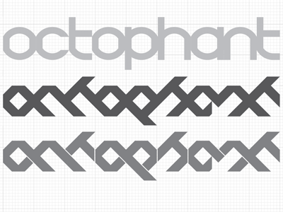
Octophant Logotype
Trying to think about a website redesign again. Last time it just turned into another print.
At top is the current logotype I'm using. Below, a couple versions of what I'm messing with. I like it, but I'm wondering if it gets too abstract. Is it important to be able to instantly read the logotype when the name is right there in the URL? People know where they are, right? (Yeah, right.)
Anyway, opinions welcome.
More by Phineas X. Jones View profile
Like
