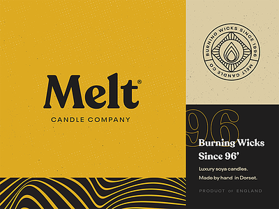
Melt Candle Co. 🕯
I've always thought it would be cool to design the branding/packaging for a candle range so in some spare time I threw together a quick style tile just for fun.
I had this idea that the logotype would be slightly warped in line with the brand graphic but wasn't sure if it just looked a bit weird, you can see this version in the attachments - which one do you guys prefer?
More from us:
More by Unseen Studio® View profile
Like


