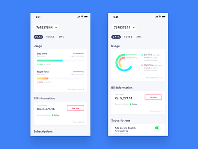
My Dialog | Mobile Services
Dialog Telecom has done a recent UI update for their My Dialog app. They are getting there, but still needs a push. I have been a user of this app for many years and this is a minimal take on how they could have made it.
There could be so many visually pleasing concept that could be done which will be an eye-candy in dribbble, but unable to develop. In this version I wanted to make sure it shouldn't be just for the sake of posting a dribbble shot, but it has to be something that would work in real life.
There are many design even i like on dribbble with large shadows, pretty colors and so many more elements, but practically they are impossible to develop as well as to use. You feel terrible when you use these apps with long shadows and funky interactions etc and prefer a minimalistic version always.
In this version, I have tried my best to deliver a design which could be easily used as well as developed without a hassle.
My Dialog app: https://itunes.apple.com/lk/app/mydialog/id723888288?mt=8

