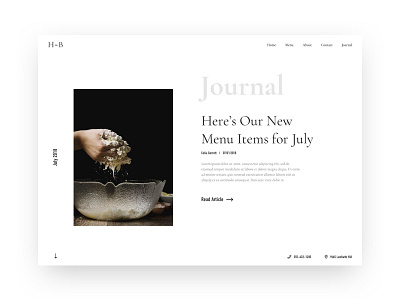
Haddie Bakery - Journal
Hi everyone!
Here's the journal/blog portion of the Haddie project. My focus was on keeping things as simple and clean on this page while adding a bit of personality to the page. It's a simple layout with an image on one side and then the article information on the other with other elements mixed in. One is the month on the left hand of the page which will change when scrolling down to the appropriate date. The journal title in a light grey and a bigger text size. Then, an arrow in the bottom left for scrolling down for more articles.
Would love to know your thoughts on this style.
Thanks, have a good day!
More by Nicholas Green View profile
Like

