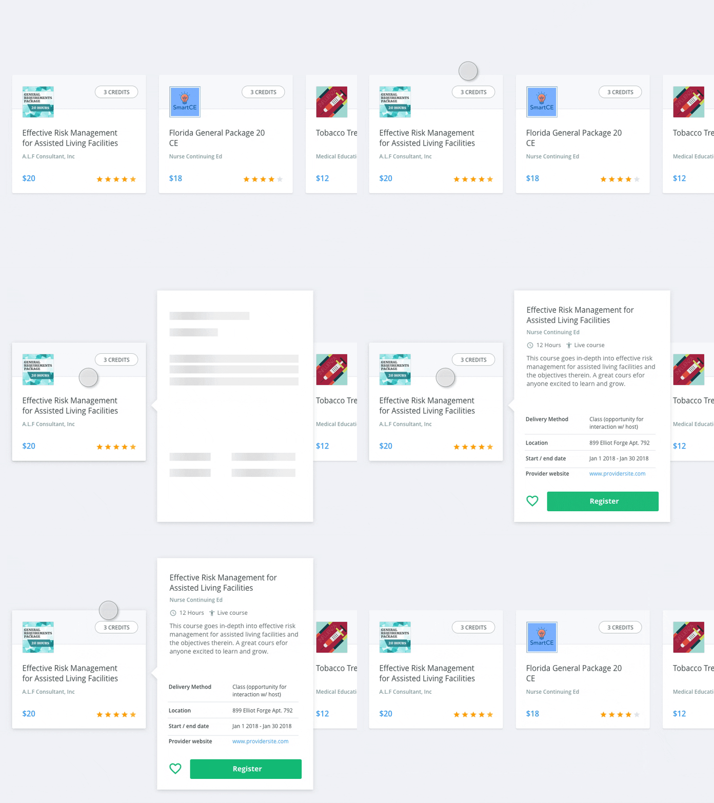
Interaction foundation - view more hovercard
Having learned this the hard way, it's easy to try to pack more information onto a card than is accessible or user friendly. In these cases, instead of designing a complicated card, opt for a hover interaction which displays more information about the item.
While this solution is optimal for desktop form factors, its a great way to keep your card designs simple without sacrificing information.
------
Have a suggestion for a common interaction pattern you'd like to see mocked up? Feel free to comment.
More by Alex Lauderdale View profile
Like
