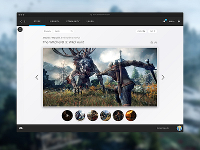
Steam Product Page Redesign - UI/UX focus
I wanted to redesign the Steam UI with the user in mind - this time, a Steam store game detail page, or essentially the 'product page'. The current product page is very information-focused and doesn't 'sell' the game visually.
User experience updates:
- Larger images / videos
- Page background matches the game to increase immersion
- Greater focus on achievements to coincide with my library page redesign: https://dribbble.com/shots/4130374-Steam-Library-Redesign-UI-UX-focus
- Easier differentiation between game bundles
- Compacted section for extra details such as system requirements, languages etc which are not necessary to be visible all the time
- Simplified reviews section
- 'More like this' section larger but placed further down the page to not distract from the main game
Let me know what you think! Please check attachments for full versions!


