How Ayopop uses design to increase its conversion rate
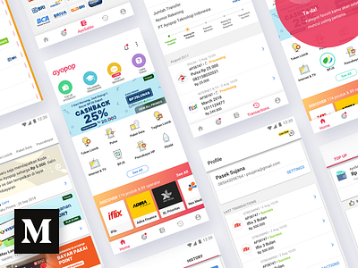
This week Ayopop launched a new experience and a fresh look for their mobile app. Over the next few weeks, users will slowly see a visual overhaul across the entire app.
We spent the last month formulating a fresh new experience and look for the Ayopop app. Here, we will highlight the redesign process and our reasons behind the most prominent design changes in the product.
--
Hire us as your design partner. Email us!
More by Flolab View profile
Like

