Personal Branding
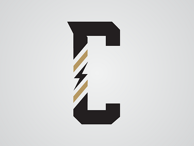
An attempt to simplify my current logo. Sharp angles, stripes and clean lines are things I admire in design and try to use them often in my own work. The stripes and lightning bolt also lend themselves to be marks that extend the brand. Can be read as just a C or a "c" and "r".
Would love to get some feedback.
More by Chris Robinson View profile
Like
