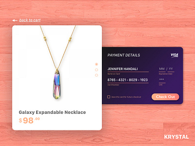
002 Krystal Credit Card Checkout
For this second debut, I tried to make an easy credit card checkout for a jewelry online shop. The forms are positioned card-like to enhance user's awareness of the step. I also provide a checkbox to remember the card for future.
Is there anything I've got to improve? Leave some awesome feedbacks! Press 'L' on your keyboard to share some love!
https://dribbble.com/jenniferhandali https://www.behance.net/jenniferhandali
More by Jennifer Handali View profile
Like
