UX/UI-Master Card
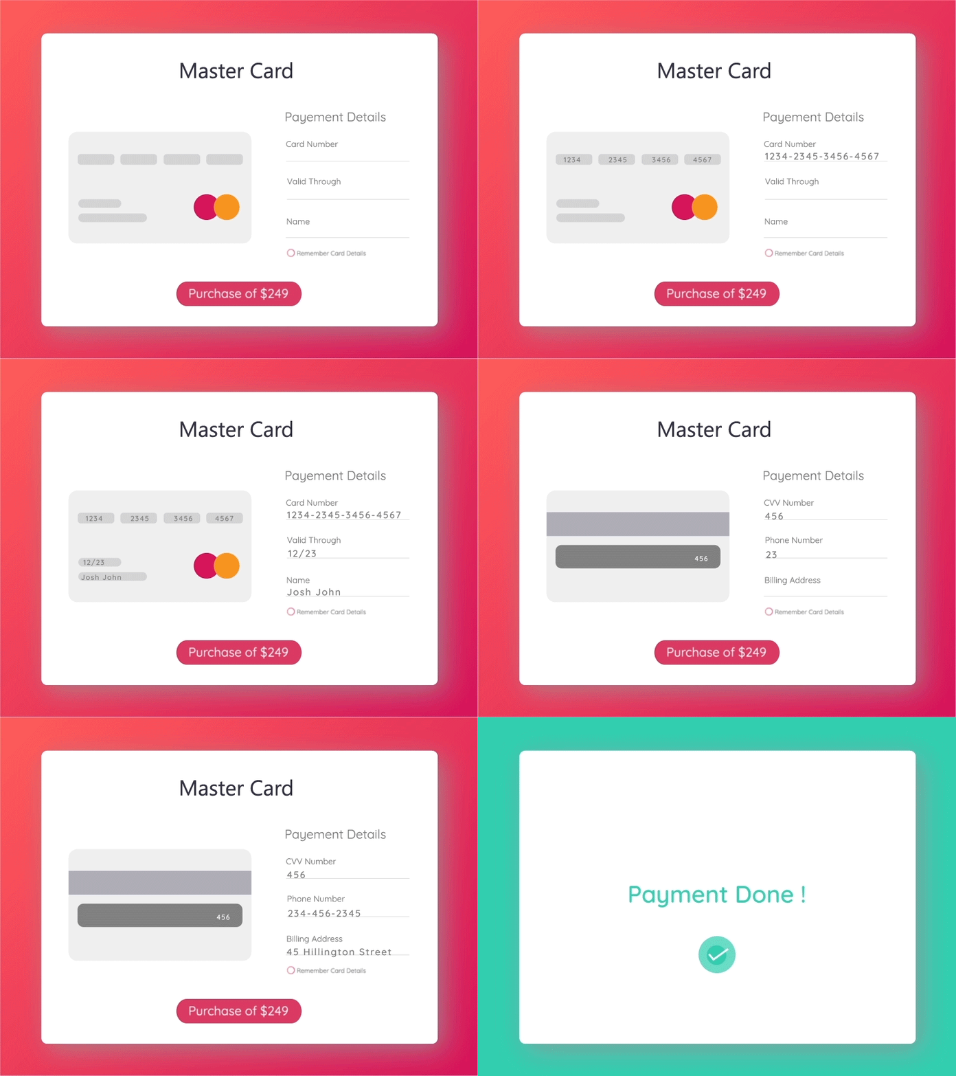
An online Mater Card payment UI, that has the type in effect to the places to be filled in the card... so that users do not get confused and we can reduce one element of the inquiry -? - near each text element. It also has an effect on the button and the background color changes when the transaction is completed. I have applied time-wrap to make the view faster.
Thanks to @Papercut Design
More by Kanan Ahalpara View profile
Like
