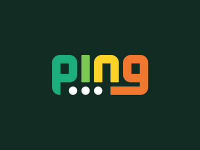
Ping - ThirtyLogos #4
Ping is a messaging app and the logo needed to be text-based. The “P” was a quick solution to the app icon needing an icon rather than text. The 3 dots are a shoutout to the ellipsis associated with messaging. The colours? 🤷🏻♂️ I just thought they looked nice. Sometimes, that’s how it goes.
If you’re interested in taking on the challenge, check out http://www.thirtylogos.com
==
Check out some more of my work here:
Behance - https://www.behance.net/roundthecorner
Instagram - http://instagram.com/roundthecorner_design_co/
More by Gary Byrne View profile
Like


