Symbol Assist, Take 2
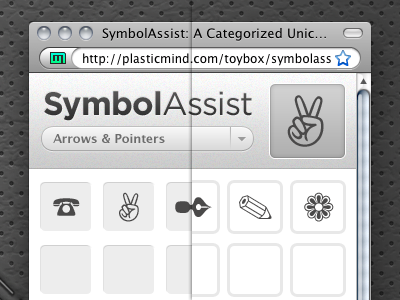
Simplified and lightened up the header. Also, experimenting with the symbol wells. The wells on the left give a bit more dimensionality to the page, but I'm afraid it'll get cluttered when the list gets longer. The wells (or rather the rounded borders) on the right work well but feel a little flat.
Which do you like better?
More by Jesse Gardner View profile
Like

