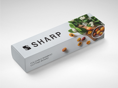
Sharp Logo Mock Up
Final Sharp logo lockup in context. I wanted to play around with the word "foldable" as seen on the product description, so I placed the image of the cutting board such that it encompasses two sides of the box to make it look like the image had been "folded." When it came to the type, I used Helvetica Bold and I took a sliver from the uppercase A to convey a cutting motion.
More by Newton Llorente View profile
Like

