Chocolate Inner V1.0
Need: Feedback on, *Layout, *Minimalism, *Emptiness, ... any will help.
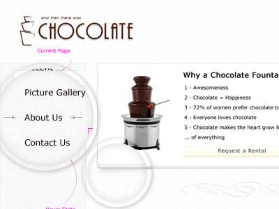
BG: This is a design makeover for a client's current site - http://therewaschocolate.com and here is the full scale of the shot: http://cl.ly/FHUm
They keep emphasizing clean, sharp, simple as very important to them. So I went uber simple, minmalistic, and clean. But it feels empty to me. Is it just me? Need some serious critiques, feedback, or confirmation.
