NikeLab Collaboration Gallery: Slider Transition Experiment
Hi there!
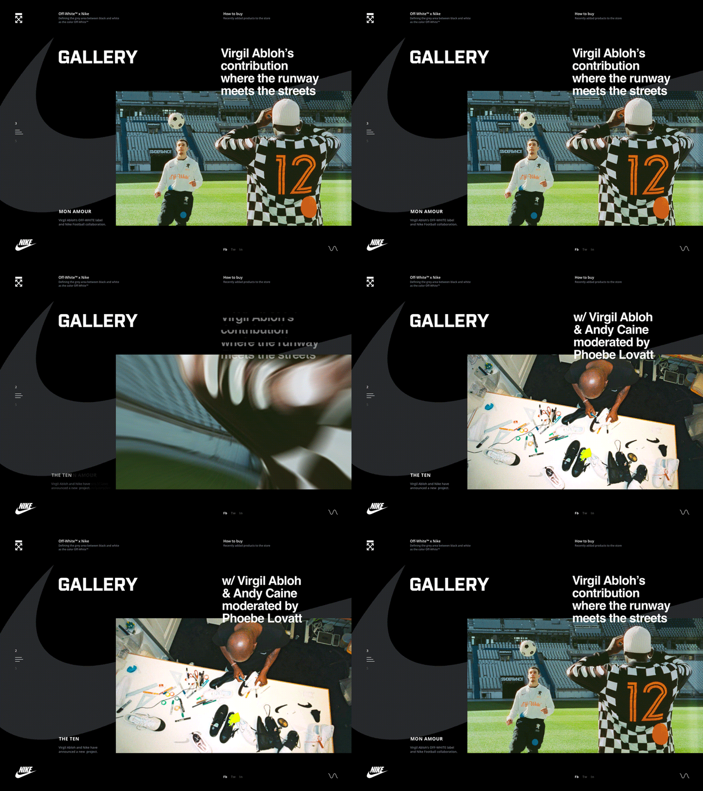
I experimented with transition effects for an alternative design for Nike Collaboration Gallery here at Zajno.
Some background: Nike collaborated with Off-White on a clothing line inspired by football (or soccer, if you're American), and I thought of how this collaboration could be presented in a somewhat unconventional way.
The primary goal was learning a bit more about transition effects, getting better at that and trying out something new. I always appreciate it when I get to spend some time on self education and just experimenting - usually it pays off nicely.
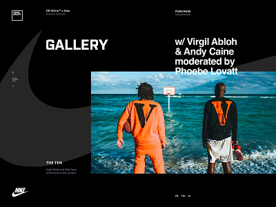
What you see above is what Nike Gallery page may look like. In terms of design, I played with the geometry of layout and composition, using broken grid. As for the slider transition effect, it’s just a juicy cherry on top, in my opinion.
Well, that's a wrap! Wonder what you think of it. Feel free to share your opinion and ideas, love hearing from you!
Press "L" to show some love!
ᗈ Join our Newsletter! ᗈ Website ᗈ TheGrid ᗈ Spotify ᗈ Twitter ᗈ Medium ᗈ Facebook ᗈ Instagram

