Product Detail Page Testing Ideas
Hi there 👋
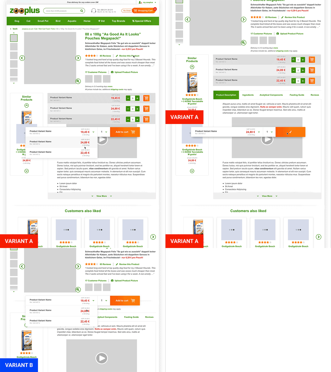
it's time to post something about e-commerce! Here are some ideas to test on this product detail page, in order to see if and how the conversion rate and the user engagement with the page varies.
Here are the thoughts behind this test:
Original / Control
- full product variant list
- each item with quantity and add to cart btn
- contra: when list is not in viewport, no products can be added to the cart
Variant A
- same layout as original with full product variant list
- when list is not in viewport: sticky bar with select box appears on top of the page and product variants can be added to the cart from there
VARIANT B
- product variant list disappears
- a prominent select box is placed instead, from which product variants can be selected and added to the cart
- by getting rid of the variant list, content/product info is placed nearer to the product hero, which contains the product name and pictures
- contra: no real overview of product variant options
