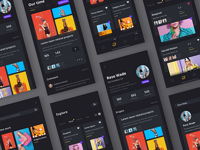
Portfolio App Design - Black & White Edition
If you've seen my previous animation, hope you all liked it.
In this shot, I want to present two versions of this portfolio app. Comment below to let me know which one you think looks better!
Show some "L" if you like it.
Follow our team😎
Dribbble | Behance | Uplabs | Instagram |
Medium | Pinterest | Twitter | Facebook |
More by Queble View profile
Like


