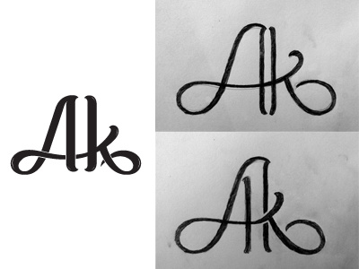
Monogram v2 for Salon of Beauty / Aтелье Kрасоты
The original monogram was the closest match to the hand-lettered logotype. However, the client expressed a desire for a more elegant monogram, a bit less weight, and gave several examples of intertwined monograms, including the well-known Louis Vuitton monogram. So, I created two version: the lighter one and the lighter+intertwined one. My concern is that it would stray away too far from the original logotype, but....these are just rough sketches to give me (and the client) an idea of how it would look. I can always bridge the gap by making the logotype lighter and the intertwined monogram slightly heavier.
Bottom line, what does everything think about the relationship of the two monograms on the right to the old logotype? Do they still work together as part of the overall identity?

