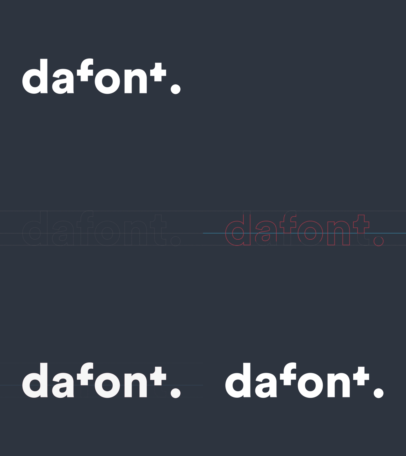
Dafont concept
Rebranding Concept I did last year with @Juan C. of the very well known website dafont.com.
The idea behind this exercise was to enhance this great free source tool for designers and give it a new identity, since the one they have is, in our opinion, quite poor.
This will be the first of 3 posts. In this first one, we show an animation explaining the how the logo builds up.
The font we used is Circular, from Lineto, one of my favourites.
In the next few days, I'll post the redesign of the website and the modular system used to design it.
Hope you enjoy it! Give us some of your Love 🤗
Cheers and see you soon!
More by André Mendes View profile
Like
