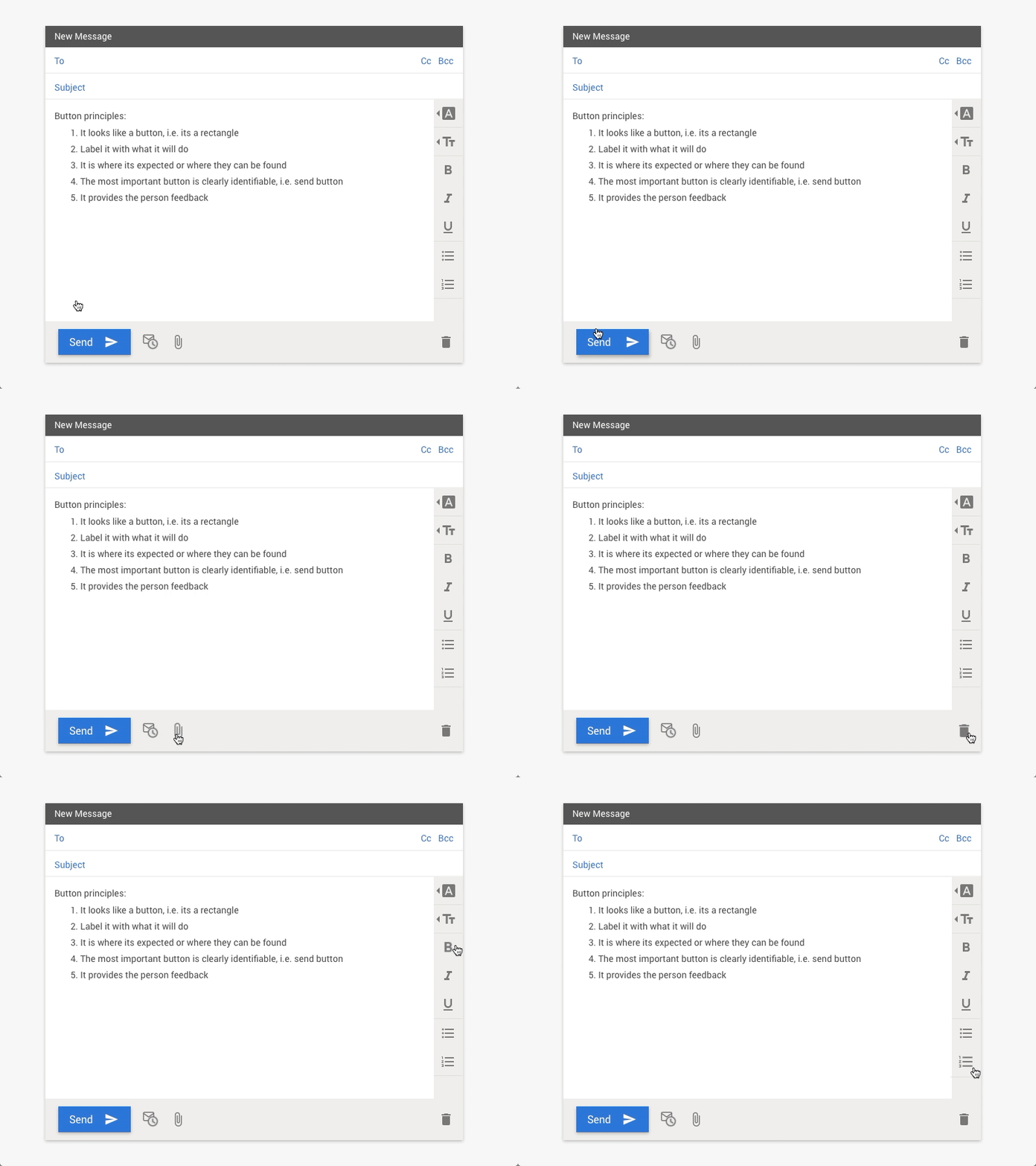
DailyUI - 083 - Button
For this DailyUI I did some googling on how to design buttons. Read a few articles and in summary these are what I think are the key principles to making good buttons. Let me know if there's something missed.
Button principles: 1. It looks like a button, i.e. in most cases its a rectangle, with a few exceptions like the floating action button (FAB) in material design 2. Label it with what it will do 3. It is where its expected or where it can be found 4. The most important button is clearly identifiable 5. It provides the person feedback
I made the .gif with Framer (as well as QuickTime, Final Cut Pro, and Photoshop)
More by Nancy Huynh View profile
Like
