Interaction foundation - Inline edit
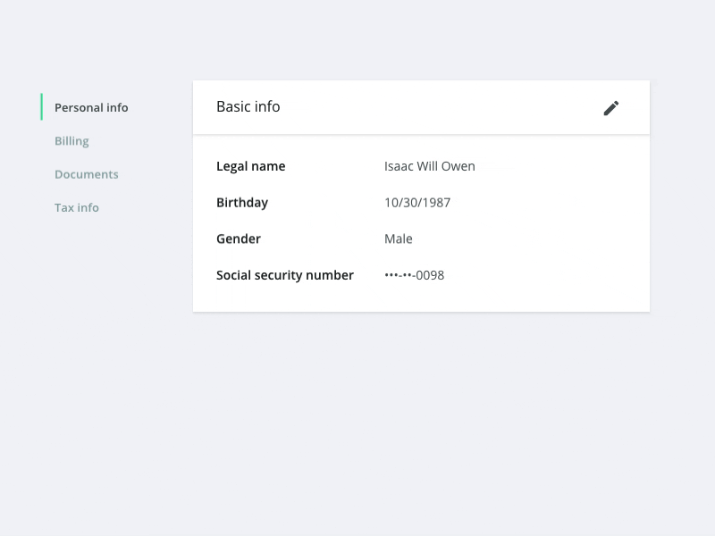
Seemingly simple interaction, but lots of little lessons learned after designing many of these:
- When designing a complicated "settings" place, separate the sections using a navigation of some sort. This keeps the page from getting too long and makes the sections immediately visible.
- For the "label: description" pairs, make sure to design enough contrast into the system so that they are easy to scan. This usually means bolding one or the other. I prefer to bold the label, but it depends on the context. Whatever you do, apply the same treatment everywhere.
- For the "Save" "Cancel" buttons, it doesn't matter which one is on the right or left, so long as you are consistent throughout your application
- Design this sort of interaction in a way which it is extendable throughout your product and can be applied to anywhere you display information which you want to edit.
-Find a default place for "actions" to live. You may end up with edit, more, delete, etc. i like to place these in a panel header of some sort.
- If you follow this pattern, make sure to be consistent with how you handle it. E.G use this common display (then) edit interaction throughout your whole app with some sort of "save" action. It can be easy to start to drift and mix interactions.