Starbucks App
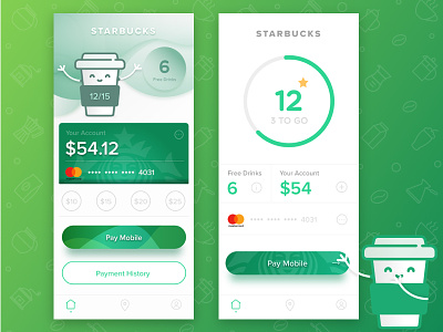


i made some ui and ux changes in starbucks app. i am using the turkish version of the app and there were some basic ux mistakes which i tried to cover, like payment button is on top of screen etc. and i wondered why they all use black, i think white/greyish colors are much better for their identity.
here are 2 versions, one more visualised and rich in content and the other is more to the mobile payment point and minimal. please share your opinions.